

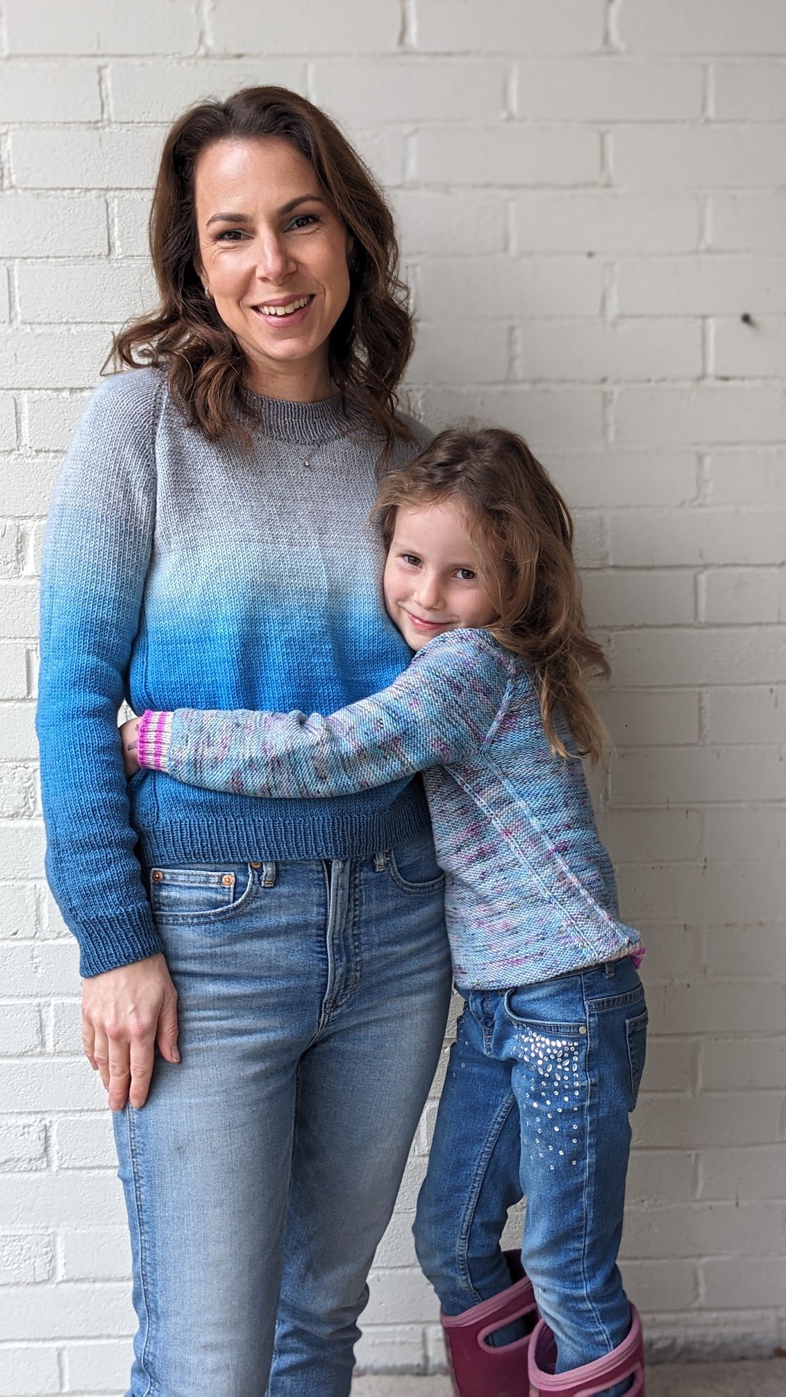
Guys! I’ve published my first pattern of the year! This is City Limits Light, the fingering weight version of my classic Worsted Weight City Limits sweater pattern. I knit my sample last year and then finished my daughter’s over the summer. I don’t know why it has taken me so long to get ‘er done but I am thrilled to have it out in the world!
I have linked the pattern above, there are loads of additional photos and details on the Ravelry pattern page and in the listing on my website, so I’m not going to go into much more detail here. One of the things that I struggled with around the time that I stopped blogging was figuring out what content to share on what platform. With the blog, the newsletter, YouTube, Instragram and Ravelry it felt like every time I had something to say I had to say it 5 times in 5 kinda-different-but-not-really ways. It was all feeling very redundant. So, I’m trying not to do that today. Each platform lends itself to different sorts of content, the newsletter is for news, Ravelry is for details, YouTube is for long winded tangents, instagram is for nonsense and the blog is for elaborate thoughts on life.
So, here are my elaborate thoughts about this sweater: it’s great. LOL! It’s such a lovely blank canvas. I feel very much the same way that I felt about publishing my worsted weight City Limits, it’s my perfect sweatshirt fit that leaves endless opportunity for customization in terms of colours. It can be striped, it can be faded, it can be solid, speckled, worn inside out. It can have ribbed cuffs and hems in whatever ribbing pattern you fancy (1x1 or 2x2 or 2x1! your call!).

I knit my sweater in a beautiful sweater kit from The Blue Brick. I fell deeply in love with her Blue Jay colourway when I first laid eyes on it. I bought a skein of worsted weight for a hat and a sweater kit in the same colourway and have zero regrets! Shireen’s gradient sweater kits are so much fun. She’s so specialized in what she does and she does it extremely well. A perfectly smooth gradient. I adore it. For my daughter’s sweater I picked one of my favourite speckled colourways and added a pop of colour with striped ribbing on all the hems. I often knit striped ribbing on my socks and was coming off of having just knit a sock featuring this hot pink stripe in the ribbing and thought that it really added a nice bit of fashion to the whole vibe. I hadn’t actually considered how well our blue sweaters would coordinate when I chose to knit all of my City Limits Light sweaters in blue but, y’know, that just kinda happens sometimes! I was in a soft blue sweater mood at the time and I love it.
I have a lot on my to-knit list at the moment but if I were to knit another City Limits Light today I think that I would pick a solid for the body and I would do some sort of rainbow ribbing. Or, maybe I would knit a tiny faded sweater, I’m seriously considering doing that with some single skeins I have stashed. Maybe the smallest size - even though I have no one in particular in mind to wear it - something to knit just for fun.

Since I’ve been suggesting to knitters that this sweater would be perfect for fading I’ve gotten a few questions from people wanting more specific details about how to fade. I’ve got a few tips! My most important tip is to choose colours that are closer to one another in colour than you might initially think. There needs to be quite a bit of overlap between the skeins. Speckles are essential for a smooth gradation of colour, no matter how hard you try with solids your fade will always be striped, but with speckles you’ve got so many overlapping tones to work with that the effect can be very subtle.
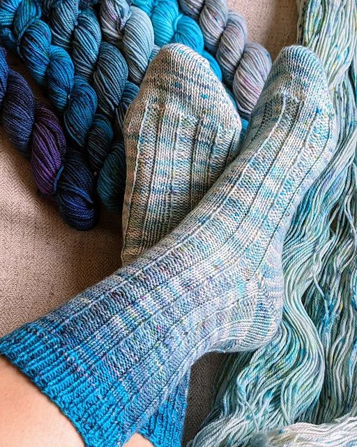
The socks above feature 4 different shades of blue and since the difference between each is quite subtle the fade is really elegant.

I really like working from light to dark within a fade. In this Ripple Bralette I used 3 different shades of speckled blue, each one decreasing in intensity as you go from bottom to top which I think adds to the overall affect of it looking like it was dip-dyed. Something about the light to dark adds to the illusion.
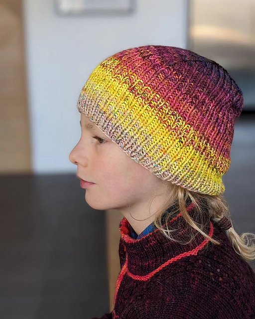
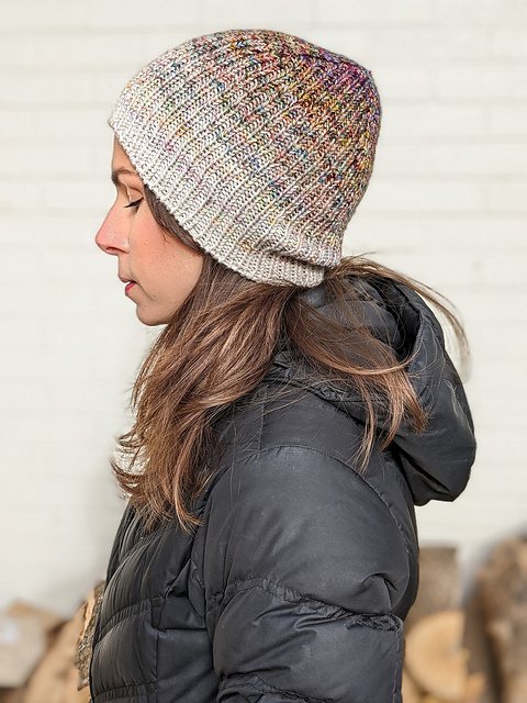
In the 2 Ceej Hats above I think the fade on the right is more effective. The palette is essentially 5 different shades of beige with varying degrees of intensity whereas the palette on the right covers much more ground. I think both hats are lovely! But since we’re talking about fades and when it comes to fades you really want one colour to fade into the next rather than striping, it’s worth comparing the two. Note that these hats were both knit holding 2 strands of fingering weight yarn together, so it’s not exactly relevant to the topic of fading for City Limits Light since you’ll only use 1 strand of fingering for the sweater, but it’s a good lesson in colour selection.
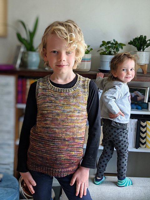
Oh my gosh I just had to include this picture! My heart! Look at that little photo bomber in the background! This vest - btw revisiting this project has made me bump this pattern up on my to-publish list! - is knit with 3 colourways of worsted weight yarn. To fade from one colour to the next I simply worked single row stripes. Start knitting a section in colour A, knit the next section alternating single rounds of colour A with colour B, then work the third section in just colour B etc. If the colourways are closely matched the transitions can be really subtle and beautiful.
If I’m really looking for the most subtle fade however, I’ll do a slightly more complicated stripe sequence where the stripes aren’t just single rounds but gradually transition.
ex: You’re working with Colour A and are ready to transition through colour B:
1 round colour B, 3 rounds colour A
1 round colour B, 2 rounds colour A
1 round colour B, 1 round colour A (3 times)
2 rounds colour B, 1 round colour A
3 rounds colour B, 1 round colour A
Continue with colour B until you’re ready to transition to colour C and repeat. This is the style of stripe transition I worked in the socks and Ripple Bralette featured above. It’s a very smooth transition indeed.
To figure out how long to knit each section you’ll have to do some math. You need to determine how many colours you want to use and how long your finished knit will be. You’ll also need to know gauge in order to determine how many inches/rounds of each colour to work. Since fades are more painterly and artistic I happen to think that it’s fine to go by feel. Change colours when it feels right. ;)
I’ve talked more about fades and shown a bunch of examples in this week’s youtube episode with Chris if you’d like to check it out.