


It's been forever since I've done a proper WIP post. Not because I'm not always working on something, and not even because what I'm working on is supposed to be a secret (spoiler alert, I hate secrets!) but just because rather than spending my time blogging about my WIPs I've been spending my time working on my WIPs. Go figure! As a result I end up with more FO posts than WIP posts and though that's lovely I really miss letting you guys know what I'm working on while I'm actually working on it rather than only mentioning it when it's done.
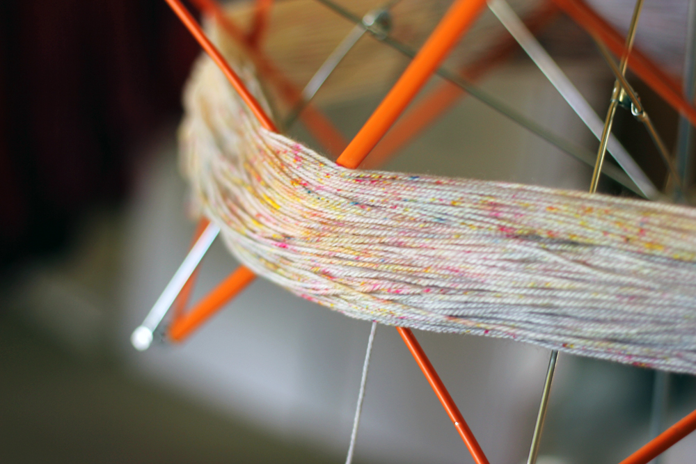
So, in the spirit of A) a WIP post and B) not keeping secrets, here is what I'm working on! I'm knitting Inky by Susanne Sommer in TFA Blue Label and 2 new super fun colourways we're working on (speckles! Yahoo!) and a skein of Malabrigo sock in the Archangel colourway that I've had in my stash for longer than I can remember - seriously, I just did a little digging and I think that it was purchased circa 2009. I love the colourway but never found the right project for it. Chris and I are experimenting with some speckled colourways (lots more news to come on that as things progress) and I really wanted to start knitting with them to see how they would knit up. Picking the project/colour combo for special yarns or new yarns is always such a struggle for me! These precious speckled skeins could have gone with any of the colourways in our collection, but I was having such a hard time narrowing down my options and in the end somehow wound up using this stashed Malabrigo skein. I have no idea why! It's knitting up beautifully, so maybe the universe intended for me to make seemingly random choices for a reason.
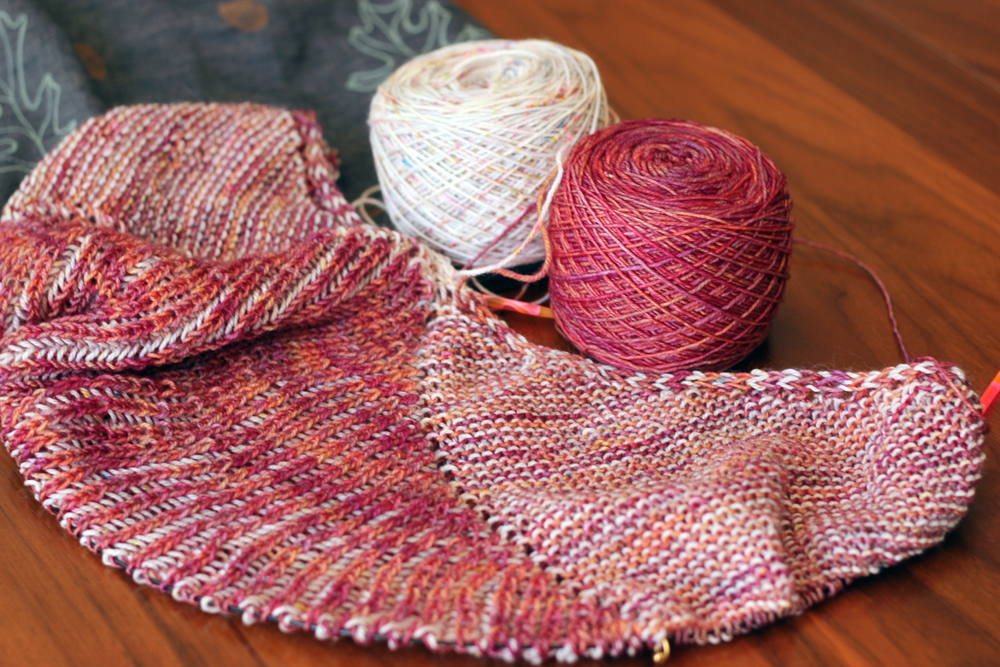
I'm loving the pattern so far. Brioche is so addictive. I completely understand why everything is popping up brioche these days! I chose to go really high contrast with my colour pairing for this project, because I thought that the pattern needed it, but I'm second guessing that decision. I think that with 2 colour brioche a more subtle colour contrast could be super nice as well. It would highlight a more nuanced, peaks and valleys look. I'm committed to my colour choice though, and blocking will have a huge impact on the final look, so I'm reserving judgement until it's done.
So, that's what I'm working on, what about you?